The Climate Hub
Educational website design for climate justice resources
Context
3rd year project
Timeline
September - December 2023
My Role
Research, Information Architecture, User Testing, UI + UX Design
Problem
My challenge was to develop a research question and solution around the subject of climate justice:
How can we increase access to climate justice information to foster a sense of urgency and hope?
Solution
My goal was to create a digital platform with clear navigation, explicit resources for learning about and acting for climate change, with an inviting and engaging visual aesthetic.
Design Process
Let's get into it!

User Journey Map +
Information Architecture

User journey map + target user group.
Information architecture of website.

Low-Fidelity Prototyping
Following the site map, I sketched the content for how the home page and a resource page could look. The goal was to direct users with clarity.

Learn Page

Landing Page Extended

Landing Page
User Interface
The goal of these visual elements is to give users a more inviting, engaging and clear way of discovering, sorting, and digesting overwhelming information relating to the subject of climate justice.
Colour Palette
High-er Fidelity Prototyping
In higher fidelity prototyping, I clarified my visual elements such as colour, symbols, and spacing before introducing interactivity.
Rather than immediately presenting all site options in a menu bar, I wanted a focused entry into the site to avoid a sense of overwhelm.

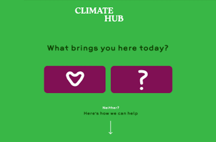

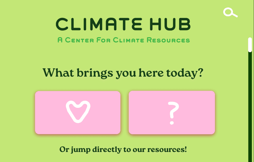
From images 1-4 you can see the user interface becomes more clean, readable, and brighter.
User Testing
With my Interaction peers, I conducted user testing to recieve feedback on my design in order to correct unclear actions and information, as well as any other weaknesses in the site.
My peer didn’t know what to click or hover over which led me to see that my interactive elements needed more distinction and must all match each other.

These questions led me to notice the visual inconsistencies in spacing and sizing, which created unnecessary confusion.
Final Prototype
In the final prototype, I took the feedback from my peers and made modifications to my site to add clarity, consistency, and improve user flow.
Psst… expand prototype and navigate through to see the full site!
Filter buttons on content pages can be clicked, revealing ways for user to sort information.
Learnings
In this project, I gained valuable insights into structuring, categorizing, and accessing large amounts of critical information. I learned the importance of early and frequent user testing, designing intuitive interactivity, creating visually engaging sites, and effectively managing my time throughout a long-term project.
In hindsight, I would simplify the colour palette, add icons to content cards to differentiate content mediums (read, watch, listen) to allow users to choose info based on their learning styles, and incorporate animations to guide interactions, like flipping 'feeling' and 'emotion' cards and highlight other key actions. Gamification could enhance the experience, allowing users to track their progress visually, and a community chat might foster connection and discussion on climate justice.